STEM provides a number of options for the format, presentation and style of graphs, which means that graphs can be displayed in a format appropriate to the data. These options are available in a number of different ways:
- from the Format menu (selection displays the menu of commands)
- by right-clicking on a blank area of the graph (this also displays the commands from the Format menu)
- by right-clicking or double-clicking on a particular item of the graph that you want to change – axis, gridlines, text, etc. – which displays the commands associated with the graph item (see 5. Results program skills for more details)
- by double-clicking on the graph item you want to change, which immediately displays the appropriate dialog.
Some options for changing graph formats are given below.
- Right-click on a blank area of the Service Expenditures graph to obtain the pop-up menu.
- Select Graph Type… to display the dialog.
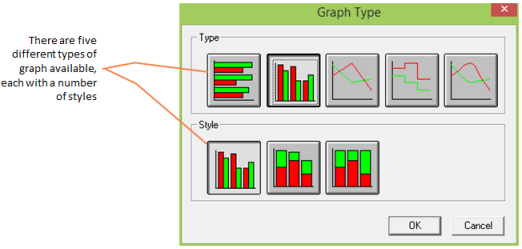
Figure 1: The Format Graph dialog
- Select the Column Type (2nd from the left in the Type row) and the vertical bar (1st on the left) from the Style and select OK. The data is displayed in columns with the data for Operating Costs, Capital Expenditure, Stock Purchases and Operating Expenditure displayed separately in columns for each year of the model run.
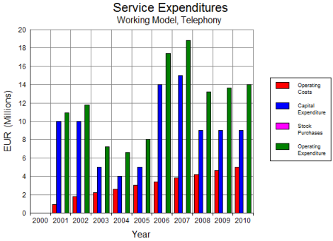
Figure 2: Column graph of Service Expenditures
It is suggested that you also experiment with other options to display the graphs, e.g., changing patterns or colour of lines or columns, hiding the legend, or formatting an axis.