In order to create a web interface from the Editor, your model must first have been saved. The default export location is a sub-folder named MyModel.web.
Creating a sensitivity element grouping the inputs for export to the web
In order to tell the Editor which inputs you would like to export, you should use a sensitivity element to gather together (and group and order) the desired inputs from multiple elements, exactly as if you were going to run a sensitivity analysis for those inputs:
- Create a sensitivity element (in this example, it is called Chocolate cake inputs).
- Open the dialog containing the input you wish to export (e.g., the Resource Capacity and Lifetime dialog containing the Capacity input.
- With Capacity selected, select Create Sensitivity… from the Variants menu.
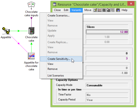
Figure 1: Creating a sensitivity element for exporting inputs to the web
- Select the relevant sensitivity element from the Choose Sensitivity For Parameter dialog.
- The Label field for the sensitivity parameter can be used to customise the labelling of the corresponding web controls (e.g., ‘Slices per cake’).
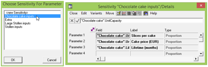
Figure 2: Selecting a sensitivity element
The Web Presentation dialog for the sensitivity element offers the following fields per parameter in order to govern more prescriptively the placement and style of the various web controls within a single tab (i.e., all visible on one page with scroll bars if required).
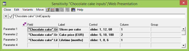
Figure 3: The new Web Presentation dialog for a sensitivity element
| Input |
Interpretation |
| Field |
References a specific input field within the model for inclusion in the web presentation. A note on this sensitivity parameter field gives the tooltip for the input. |
| Control |
Specifies the type of control used for a field in the web presentation as follows:
(empty string)
the default control specification is slider for scalars and grid for interpolated series.
slider: <step>, <min>, <max>
displays a slider control. If provided, step gives the step size and number format, min gives the minimum value and max gives the maximum value. A ‘%’ after any of these values causes it to be divided by a hundred, and after step indicates that the web interface should present this input as a percentage rather than at face value. If the step, minimum or maximum are omitted then they will be given defaults based upon the range of the sensitivity field (i.e., the Up and Down parameters and default value).
spin: <step>, <min>, <max>
displays a spin box control (text input field plus up and down buttons). The step, min and max arguments are interpreted in the same way as those for a slider control.
grid: <max_cell_width>
displays a grid; valid only for interpolated series. The number of columns is determined by the actual periods defined in the interpolated series in the model. The max_cell_width argument is optional. If specified, it gives a maximum width in pixels for each individual cell within the displayed input grid.
checkbox
displays a checkbox control. The corresponding input will be set to 0 if the box is unchecked and 1 if it is checked.
option-across: <option1>, <option2>,…
displays a multiple choice option control presented as a set of selectable buttons similar to those used for the input and result page selection laid out in a horizontal line. Each option should be a string enclosed in double quotes. C-style escaping is understood, but is required only for backslash and double-quote characters. At least two options must be provided. The corresponding input will be set to an integer in the range [0, n – 1] if there are n options.
option-down: <option1>, <option2>,…
the same as the option-across control, but the buttons are presented in a vertical rather than horizontal layout.
option: <option1>, <option2>,…
this is the same as the option-across control.
radiobutton-across: <option1>, <option2>,…
displays a multiple choice option control presented as a horizontal row of radio buttons. Options are the same as for the option-across control.
radiobutton-down: <option1>, <option2>,…
the same as the radiobutton-across control, but presented as a vertical column of radio buttons.
radiobutton: <option1>, <option2>,…
this is the same as the radiobutton-across control.
latchedcheckbox-across: <option1>, <option2>,…
displays a multiple choice option control presented as a horizontal row of checkboxes, only allowing one to be presented at a time. Options are the same as for the option-across control.
latchedcheckbox-down: <option1>, <option2>,…
the same as the latchedcheckbox-across control but presented as a column of checkboxes.
latchedcheckbox: <option1>, <option2>,…
the same as the latchedcheckbox-across control.
dropdown: <option1>, <option2>,…
displays a multiple choice option control presented as a dropdown menu. Options are the same as for the option-across control.
If the text that you wish to enter into the Control field is longer than the 31-character limit, you can add a note to the field. The text in the note is appended to any text in the field itself.
|
| Column |
You may optionally group the inputs into columns. You can specify a number like 1, 2 or 3 for anonymous columns, or strings like Column 1, Column 2 or Column 3 for columns with headings. The number of the anonymous column or a number at the start of the column string will not be displayed in the interface and will control the order of the columns, from left to right. If the corresponding Field is blank, then this results in a blank cell in this column. |
| Group |
You may optionally use the same string for several consecutive fields for them to be indented and/or boxed under a sub-heading. Groups specified in this manner span all columns. |
Figure 4: Explanation of the new Web Presentation inputs for a sensitivity element
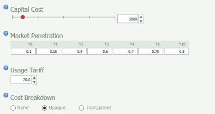
Figure 5: The corresponding controls in the generated web interface
The tab will be presented with a title matching the name of the sensitivity element. If the allowance of twenty parameters per sensitivity element is insufficient, then you can use continuation elements with names like MySensitivity2, MySensitivity3 and so on to extend the scope. STEM will then generate a single tab controlling all of the referenced fields with the same title as per the original sensitivity element.
Exporting selected inputs from the Editor
Having identified which inputs you wish to export, you can now actually export them to a web presentation:
- Select Create Web Interface… from the File menu. The Create Web Interface dialog is displayed.
- Enter a Title for your web presentation (if the model filename is not suitable).
-
Make sure that the list of Elements to Export is as expected. Cancel and reselect them if not.
- Check that your desired Output Folder path is displayed. If not, click the Change button to select the destination that you would like to use.
- Press OK. The Editor creates or updates the relevant files and then opens Windows Explorer in the output folder unless you have unchecked Explore Output Folder.
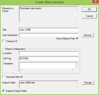
Figure 6: The Create Web Interface dialog
Further options in the Create Web Interface dialog
Other options in the Create Web Interface dialog include:
-
User Stylesheet: you can set the path to provide a custom stylesheet to add or override display preferences for the exported web interface.
-
Compact UI: if you would like to create a compact web interface rather than the default layout then tick the checkbox Compact UI.
-
Report Configuration: you can enter the location of download, cell tag and template names for the web reports if you plan to use them.
-
Generate New ID: if you would like to generate a new configuration ID for the export then tick the checkbox Generate New ID. Usually you will only want to do this if you are working with a Saved-As copy of a model whose web exports you want to keep separate.
Creating a multi-tab web interface from a selection or collection of sensitivity elements
If there is too much information to fit onto ‘a single screen’ and you are not keen on the use of scrollbars, then it is also possible to create a ‘tabbed’ interface. If you select a number of separate and distinctly named sensitivity elements as described above, then each sensitivity element will define an individual tab in the web interface, and the tabs will be presented in the same order as they appear in the Editor, working from left to right and then down the selection.
Alternatively you can control the order more robustly by including each of the sensitivity elements within a collection, and then just selecting the collection prior to the export.
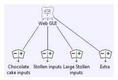
Figure 7: Controlling the tab order with a collection of sensitivity elements
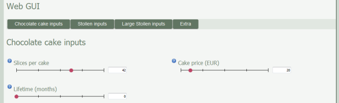
Figure 8: The corresponding multiple tabs in the generated web interface
You can even create a hierarchy of nested tabs by creating a collection of such collections of sensitivity elements – try it!