STEM produces a large number of time-series results for the whole network, as well as the main types of model element: services, transformations, functions, resources and cost indices. Several results can be compared on one graph, and a set of built-in graph definitions is provided in order to help you review them rapidly and consistently. In order to draw a graph:
-
Open a new view by clicking on the main View menu and selecting New.
-
Select Draw… from the Graphs menu. The Draw dialog opens.
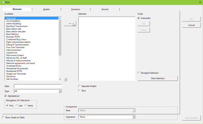
Figure 1: The Draw dialog (Elements tab)
-
In the Elements tab, select the element you are interested in from the list of Available elements (e.g., Network) and either double-click or press the
 button to move it to the list of Selected elements.
- Click on the Graphs tab to move to the graph selection interface.
- Use the mouse to select the graph you want to draw (e.g., Capital Expenditure.)
- Enter the Scenarios tab, where any scenarios for which results are currently loaded will be listed.
-
Select the Slow, Moderate and Fast scenarios (by holding down the Shift key while you click on them) and move them to the Selected box by clicking the button.
- Press OK to draw the graph
- A graph is drawn, comparing the network Capital Expenditure result for each of the three scenarios.
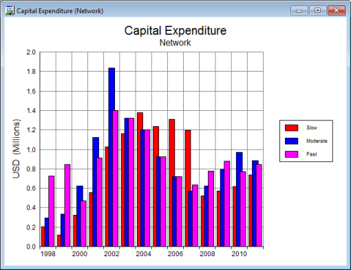
Figure 2: The network Captital Expenditure graph for the Slow, Moderate and Fast scenarios.
The Format menu can be used to change the appearance of graph windows (alternatively, the same options can be accessed by right-clicking on a graph). In particular:
-
select Show Graph as Table… to display the underlying numerical data in a table
-
select Graph Type… to change the graph format, e.g., to a column graph
At this stage, we suggest that you spend some time browsing through the other graphs of the model results.
The following graphs provide an introduction to the scope of results produced by STEM. Before proceeding it may be helpful to close any graphs you have drawn so far: select Close All from the Graphs menu. Draw these graphs by selecting Draw… from the main Graphs menu and accessing the Draw dalog, as described previously.
 Service Demand – Connections
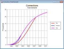 In the Draw dialog, select the Total Demand service, the Connections graph and the Slow/Medium/Fast scenarios. Note how the total number of subscribers varies with the three roll-out strategies: the impact of decreasing the roll-out period from ten years to five years is clearly visible, but providing full coverage after two years only adds a small additional number of subscribers in the early years of the model, and implies that a fast roll-out is not financially advisable.
Resource Installed Units
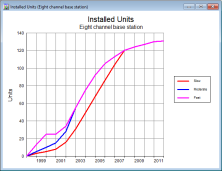 Select the Eight channel base station resource, the Installed Units graph and the Slow/Medium/Fast scenarios. Once you have drawn the graph, select Show Graph as Table… from the Format menu (or by right-clicking on the graph and selecting Show Graph as Table…). Check that for the three scenarios the number of base stations is driven by coverage from 1997 to 2000, and then by busy-hour demand in the subsequent years. This is particularly visible in the Fast case, where the 25-sites constraint is binding in 1999 and 2000.
Network Cashflow from Operations
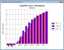 Select Network in the Elements tab, the Cashflow from Operations graph and the Slow/Medium/Fast scenarios. (Note: you will need to select the Standard option in the Include section of the Graphs tab for the Cashflow from Operations graph to be listed.) This graph represents the total service revenue minus the outlays on equipment in each year. Note the difference between Slow and the two other scenarios between 2003 and 2007. This is due to the high capital expenditure required in the Slow scenario during that period to provide full coverage over 25 sites, as well as the revenues foregone by not being able to meet the total demand.
Network Cash Balance
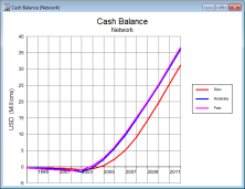 Select Network in the Elements tab, the Cash Balance graph and the Slow/Medium/Fast scenarios. (Alternatively, right-click on the network Cashflow from Operations graph and select Change Selections…. Select Cash Balance in the Graphs tab and press OK to draw the graph. All other selections in your original graph (i.e., network and the three scenarios) will remain unchanged.)
This is the cumulative retained cashflow, allowing for interest and tax. This graph confirms that both the Moderate and Fast scenarios have a shorter pay-back period (achieved between 2003 and 2004), as well as higher terminal cash surpluses.
Select Network in the Elements tab, the Cash Balance graph and the Slow/Medium/Fast scenarios. (Alternatively, right-click on the network Cashflow from Operations graph and select Change Selections…. Select Cash Balance in the Graphs tab and press OK to draw the graph. All other selections in your original graph (i.e., network and the three scenarios) will remain unchanged.)
This is the cumulative retained cashflow, allowing for interest and tax. This graph confirms that both the Moderate and Fast scenarios have a shorter pay-back period (achieved between 2003 and 2004), as well as higher terminal cash surpluses.
Once you have drawn these four graphs, select Tile from the Graphs menu. The four graphs are arranged side by side, allowing you to view the overall profile of the investment.
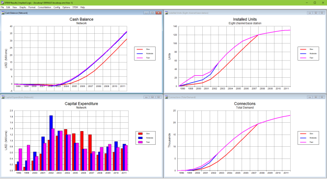
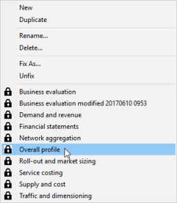
As you opened a new view before drawing these four graphs, it was automatically called View 1. You can fix this view by selecting View/Fix as… and typing in a new name when prompted (e.g., Overall profile).
In order to store this set of graphs for future recall:
- Select Fix As… from the View menu. The Fix As View dialog is displayed.
- Enter a short description of the view and press <Enter>.
The newly named view is added to the set of defined results views, which are listed at the bottom of the View menu (in alphabetical order).
Selecting one of the named items at the bottom of the View menu closes all current graphs and tables and restores the previously saved layout.