By default, STEM presents sensitivity results as so-called ‘tornado charts’ in which the result for a particular period is plotted (like a snapshot), with separate horizontal bars for each parameter (or group of parameters) from a sensitivity element. These bars are sorted in order of decreasing significance, so that the parameter with the greatest impact appears at the top. The length of the horizontal bars indicates the deviation, for each step, from the base-case results.
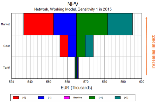
More than one sensitivity set can be combined in a single tornado chart, so you can create and retain a variety of different comparisons (e.g., demand versus cost, or respective service penetrations), but still plot them all in a single tornado chart to find the most critical inputs overall.
Changing the format of a sensitivity graph
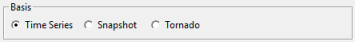
If you would prefer to present your sensitivity results as either a time-series or snapshot chart, then enter the Format tab on the Graphs dialog and select either Time Series or Snapshot in the Basis section (see 5.2.7.2 Basis).