All of the business modelling techniques described so far revolve around established processes, structured calculations, and careful organisation of data. However, there is always the possibility that if you are too disciplined and rigidly methodical, you may miss a critical business risk which lies outside the envelope you first imagined. Therefore it is essential to stress test a model in an almost random fashion to check for unforeseen business issues.
Like scenario analysis, this sensitivity analysis is hardly rocket science at the detailed level, but significant complexity creeps in if you want to quickly vary, say, twenty inputs across a model up and down a few percentage points and graph the comparative impact on a key business result. This functionality is built into the STEM platform, such that you can ‘point and click’ at the model inputs which you wish to include and immediately generate a so-called ‘tornado’ chart. Additional options allow you to group correlated inputs, and to vary the number and size of steps. Whereas you might think twice about the overhead of setting this up yourself, if you know that a pre-validated tool exists which will create a calculation structure that you can trust, then you are much more likely to include this vital task in your work.
As an example, we have examined the size of the market, the tariff for video on demand, and a number of infrastructure costs correlated together as a single sensitivity. The corresponding tornado chart for 2015 demonstrates that changing the market size has the most impact on the NPV. Drawing the same chart for 2010 demonstrates greater sensitivity to the infrastructure costs because the network utilisation is lower at this stage of the business evolution. Notice how the colours in the chart reflect the positive or negative impact on the result (market size or tariff compared to cost). Using multiple steps provides a very visual indication of the linearity around the base results.
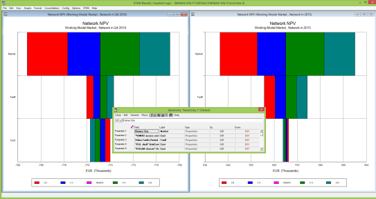
A tornado chart illustrates comparative sensitivities