An integrated sensitivity engine automates the process of testing the relative impact on key results of percentage changes to selected model inputs, or changes across specified, expected market ranges.
So-called ‘tornado’ (bar) charts demonstrate the impact of these inputs on a given output, ranking the inputs from the most sensitive at the top, to the least sensitive at the bottom (hence the name).
 Save the model as WiMAX-DSL17
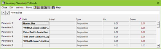
You will create a Sensitivity element and add parameters just like you do for a Dimension, but with the difference that the steps are automatically generated for a sensitivity (no explicit Variant Data). Each sensitivity parameter is varied independently, whereas the parameters for a Dimension are varied coherently (according to the columns in the Variant Data table).
- Go to the Size input for the Homes element (Details/Size).
- Click on the Size button to make sure it is selected.
- Select Add as a Sensitivity Parameter… from the dialog Variants menu.
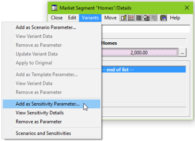
A new Sensitivity element is created and the Details dialog is displayed, showing Homes.Size as the first parameter.
- Repeat this process for the Capital Cost of the WiMAX access sector resource, and also for the Rental Tariff of the Video service.
- Select the existing Sensitivity 1 element (created in step 3) when you are prompted to choose a sensitivity element for the new parameters.
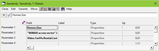
By default, each input will be varied up and down 1%. If you change the Up, the Down will show the same value, as it is linked with a formula.
 Save and run the model and its sensitivities
- Select Scenarios and Sensitivities… from the File menu in the Editor. The Scenarios and Sensitivities dialog is displayed, with the new sensitivity listed at the bottom.
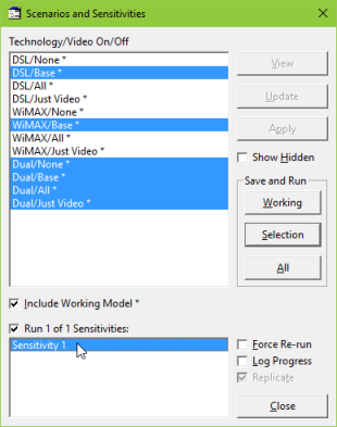
- Click to select Sensitivity 1, and then run the working model by clicking the Working button under Save and Run.
The status bar at the bottom of the Editor will show STEM processing the various sensitivities (up and down one step for each parameter in turn), and then the results will load.
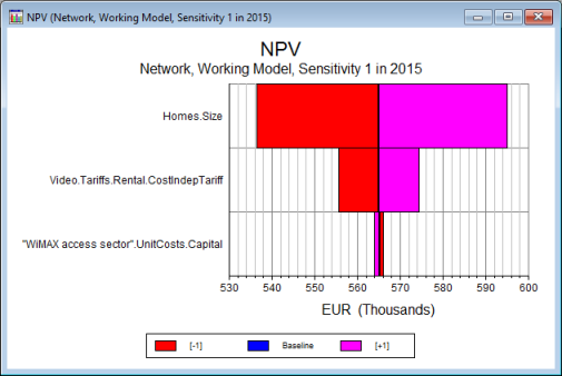
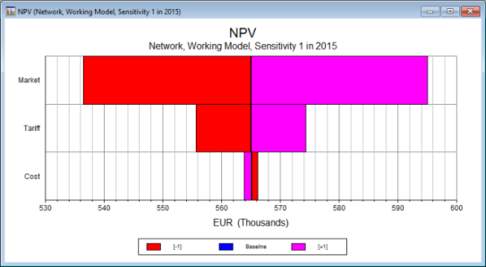
- Select Draw… from the Graphs menu in the Results program. The Draw dialog is displayed.
- Select Network and NPV in the Elements and Graphs tabs, respectively.
- Switch to the Sensitivities tab and add Sensitivity 1 to the Selected list.
- Change to the Format tab and note that the Basis is set as Tornado.
- Press OK to draw the graph. The resulting tornado chart indicates that the size of the market is the most critical input selected.
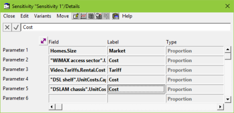
Let’s add some more of the infrastructure costs to the sensitivity test.
- Go back to the Editor and add the Capital Cost of the DSL shelf and DSLAM chassis resources to the same sensitivity. (The Base station site does not have a capital cost.)
- Re-run the working model and the sensitivity.
Now you will get five bars on the tornado chart. However, there may well be a correlation between the infrastructure costs.
- Go back to the Editor and go to the Details dialog for Sensitivity 1.
- Set the Label for each parameter as shown below.
- Re-run the working model and the sensitivity again.
Not only will the bars on the chart be labelled more succinctly, but parameters with matching labels are grouped together and run as a single sensitivity (i.e., increasing those specific parameters up and down together).
Note: there is no specific feature that can be used to generate best case or worst case sensitivity results, but you could use the same label to group parameters together to get the same effect.
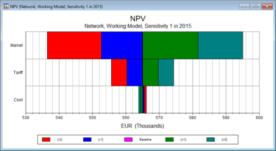
- Return to the Editor and go to the Parameters dialog for Sensitivity 1.
- Change the input Steps = 2.
- Re-run the working model and the sensitivity again.
You can see the two steps each way on each of the bars. Notice how the colours in the chart reflect the positive or negative impact on the result (market size or tariff compared to cost). Using multiple steps provides a very visual indication of the linearity around the base results.
Changing the period for a tornado chart
You may have noticed that the Results program has automatically selected 2015 as the period for the tornado chart you have drawn. This is the final period of the model run, and the most common choice for assessing project outcomes. You can, however, change this to a different period of the model run:
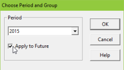
- Right-click the chart and select Choose Period and Group… from the popup menu. The Choose Period and Group dialog is displayed.
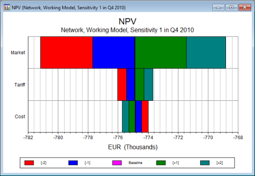
- Choose Q4 2010 from the Period drop-down and click OK.
The chart is updated to show data for the new period, and reveals greater sensitivity to the infrastructure costs because the network utilisation is lower at this stage of the business evolution.
You can use <Ctrl + Plus>
and <Ctrl + Minus> (‘plus’ and ‘minus’ from the numeric keypad) to jump straight to the next or previous periods for the current chart. (See also the Format menu.)
Draw a new graph for a different period
- Draw exactly the same chart again (use Draw Another … option). You will get another graph for 2015, assuming the original still shows Q4 2010.
- Draw exactly the same chart again. Because a chart showing the same results selection for the same period already exists, this time the Results program prompts for a different period.
If you choose Q4 2010 or 2015, then the existing graphs will be activated. Otherwise a new chart will be drawn for a different period.
Check the Apply to Future box in the Choose Period and Group dialog to change the default period for new graphs.
Snapshot charts and tables
You may have noticed the Snapshot basis in the Format tab of the Draw dialog.
- Draw exactly the same chart again, but this time as a Snapshot.
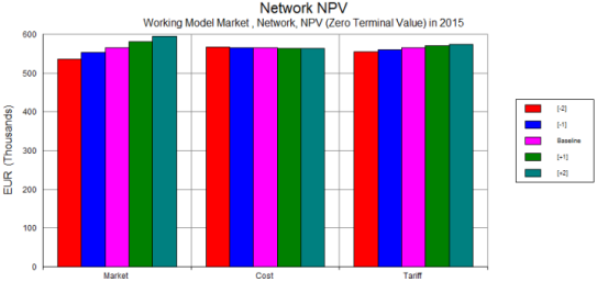
Like a tornado chart (and as its name suggests), this also presents data for just one period, but this time as a column chart. By default, the sensitivity parameters provide the graph ‘categories’ (i.e., the labels on the x-axis), which serve to group the steps per parameter.
Comparing scenarios, elements or results
This can be useful for comparing different scenarios or elements when there are too many results to display on a conventional time-series chart.
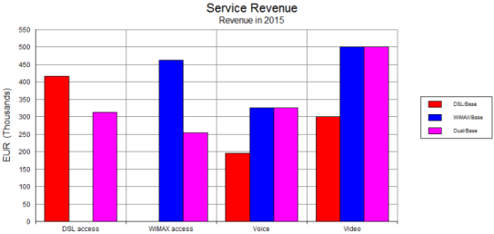
- Go back to the Editor and run the scenarios DSL/Base, WiMAX/Base and Dual/Base if you have not already done so.
- Go to the Draw dialog. In the Elements tab, select Services from the Type drop-down menu to filter the list of elements, and add all the services except for Internet Access (for which no tariff is charged) to the Selected list (four in total).
- Switch to the Graphs tab and select the Revenue graph option.
- Change to the Scenarios tab and add the three scenarios, DSL/Base, WiMAX/Base and Dual/Base, to the Selected list.
- Switch to the Format tab and select the Snapshot option.
- Press OK to draw the graph: 12 series will be drawn (4 elements × 3 scenarios).

Hold down the <Ctrl> key while clicking to select (or de-select) separate items in the list of elements.
The resulting chart groups the results by scenario as shown below.
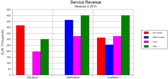
You can see that (at least in 2015) there is no WiMAX revenue in the DSL/Base scenario, and no DSL revenue in the WiMAX/Base scenario.
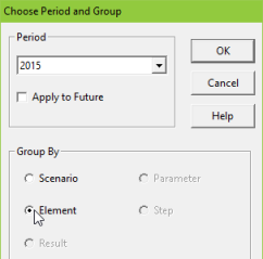
Changing the grouping for a snapshot chart
- Right-click the chart and select Choose Period and Group… from the popup menu. The Choose Period and Group dialog is displayed.
- Select Element in the Group By box and click OK. The chart is re-drawn with the element names on the x-axis.
If you draw a chart which shows more than one result, such as Service Revenues (plural: connection, rental and usage revenues), then you can also choose to group a snapshot chart by result.
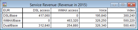
Like any other chart, you can also show a snapshot graph as a table:
- Try drawing Network Financial Indicators as a snapshot for the same three scenarios selected above.
- If there is time, go back to the Details dialog for Sensitivity 1 and try out the Delta and Absolute options for the Type input. (Press <F1> for help!)
 Things that you should have seen and understood
Sensitivity, tornado chart, snapshot chart, default period for chart, grouping for x-axis
Parameter, Label, Type, Up, Down, Perturbation, Steps, Basis, Choose Period and Group