In order to calculate the year-on-year results, models are usually run directly from the Editor by selecting Run from the File menu. When the run is complete, the results are loaded automatically into the Results program. Alternatively, models can be run from a toolbar within Microsoft Excel – see 7.3.6 Running STEM from Excel – in which case the Results program (results.exe) can be loaded directly.
The STEM Results program is designed to provide instant access to the results generated when a STEM model is run, providing quick, ‘what-if’ analyses of the effects of changes to the model input data. Results are displayed on the screen in both graphical and tabular formats, and can be compared between different elements, and also between different models.
Graphs and tables can be printed or exported to other applications, and the underlying numerical data can be saved to disk in a variety of customisable formats.
Looking at graphs of the results
STEM produces a large number of time-series results for the whole Network, as well as the main types of model element: Services, Transformations, Functions, Resources and Cost Indices. Several results can be compared on one graph, and a set of built-in graph definitions is provided in order to help you review them rapidly and consistently. In order to draw a graph:
-
Select Draw… from the Graphs menu. The Draw Graphs dialog appears, showing the list of pre-defined graphs.
-
Select a graph to draw, for example Network Capital Expenditure, by highlighting it with the cursor and then clicking on the OK button. The Choose Scenarios to Draw dialog appears, listing the scenarios for which results are currently loaded.
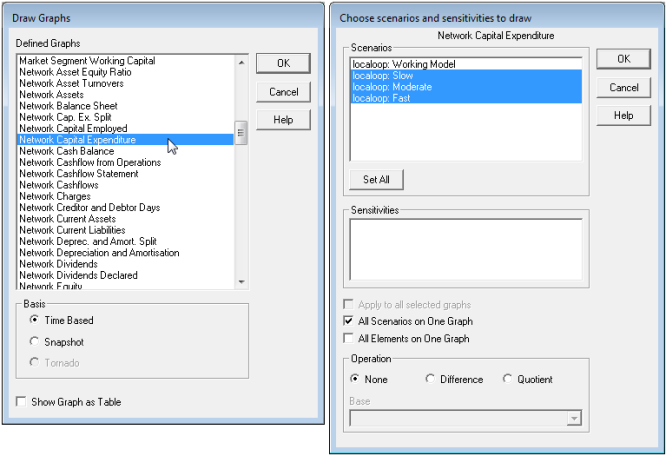
Figure 1: The Draw Graphs and Choose Scenarios and Sensitivities to Draw dialogs
-
Select the desired scenarios (by holding down the <Shift> key while you click on them), tick the All Scenarios on One Graph check box, and then click the OK button. A graph appears, comparing the Network Capital Expenditure result for each of the chosen scenarios.
The Format menu can be used to change the appearance of graph windows. In particular:
- Select Format Graph… to change the graph format, e.g., to a column graph
-
Select Show Graph As Table… to display the underlying numerical data in a table.
In addition, you can press <F1> to view an explanation of the results shown on a graph; or press <F2> to drill down into the precedent results.
At this stage, it may be helpful to spend some time browsing through the other graphs of the model results. The procedure is essentially the same, except that for Service and Resource results and so on, you also have to choose the elements for which you want graphs to be drawn.
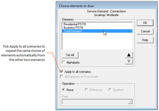
Figure 2: The Choose Elements to Draw dialog
In order to understand the dynamics of a model it is helpful to trace through some of the key results, from Service Demand and Revenue through to Resource Installed and Incremental Units, Expenditure, and various Network aggregations and financial indicators.
Customising views of the results
In addition to the built-in graph definitions, you can create graphs by selecting several results directly, using the Draw New… command on the Graph menu. More generally, you can customise the Results program to suit your own requirements, by:
- adding new graph definitions to the pre-defined list
-
creating table reports for export to other applications, such as spreadsheets, based on the particular results you are interested in
- renaming results, and adding new results derived from the basic results.
All of these details can be saved in a configuration file. The names of the current configuration and loaded model results can be saved as a workspace file, to make it easier to start your next session.