Once you have selected the elements you want to draw graphs for, you can switch to the adjacent Graphs tab to view (and select from) a list of relevant pre-defined graphs. This tab is analogous to the list of pre-defined graphs accessed using the Draw… command in STEM 7.4. The list of available Graphs to draw can be customised further to show various degrees of detail or familiarity.
In order to draw a graph, simply select the graph(s) you want to draw and press OK.
The available Graphs to draw are limited by default to those that are available for all of the selected elements. So, if you have selected elements of different types such as service and resource elements, results such as Operating Charge which are common to both types are listed as Available, whereas results such as Revenue and Installed Units, which are specific to services and resources, respectively, are not shown.
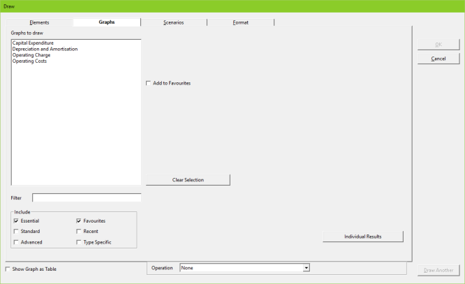
Figure 1: The Graphs tab, with list of graphs available for all selected elements (service and resource types)
The Graphs to draw list can also be narrowed using a filter: for example, entering ‘op’ means that just the Operating Charge and Operating Cost graphs are listed. This is particularly useful if the list of graphs to draw is extensive.
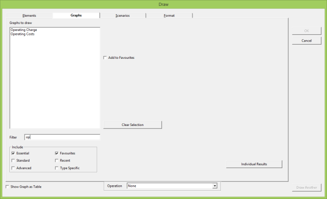
Figure 2: Using the Filter to limit the number of graphs listed
You can also customise the number of graphs available to draw by selecting Essential/Standard/Advanced/Favourites/Recent/Type Specific in the Include box.
-
Essential: shows the graphs used most frequently by most users, sufficient for a first-pass high-level analysis.
-
Standard: shows graphs generally of interest to most people.
-
Advanced: shows all the graphs available, including the most obscure ones!
-
Favourites: shows all graphs noted as favourites, in addition to those already displayed (i.e., will be shown if box checked, even if Essential selected too).
-
Recent: shows the 20 most recent graphs drawn (by default), in addition to those already displayed.
-
Type Specific: see explanation below.
There are about 30 Essential pre-defined graphs; these are the graphs you will need most of the time and which can be selected easily without scrolling if the other categories are turned off. No more than half of the Essential graphs are available for any single element type (or the network). In approximate terms, there are then 60 Standard graphs and a further 5 Advanced graphs. You may choose to ‘favourite’ a few of these to avoid having to browse through the other categories all of the time.
Checking the
Type Specific
option in the
Include
box adds any graphs that are only available for a particular element type to the
Graphs to draw
list (e.g., Revenue for a service even if one or more resources are already selected for this graph).
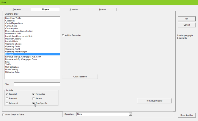
Figure 3: Additional graphs for services or resources listed only after selection of Type Specific option
Note: the results program will remember your Include options from a previous session. So, for example, if you checked the Essential, Standard and Favourites options when you last used the Graphs tab, then when you next use the Graphs tab, these selections will have been retained. The exceptions to this are the Filter and Type Specific settings, which are only retained when you choose the Draw Another option (see 5.2.5 Drawing a graph, or several, and maybe some more).
You can select which graphs you want to draw by clicking on them: multiple graphs can be selected using <Shift + click> for a contiguous selection or <Ctrl + click> for a non-contiguous selection. You can ‘favourite’ graphs by selecting them and then clicking Add to Favourites, so that they will be easily accessible in future when the Favourites option is selected in the Include box.
If there are no scenarios in your model, or if you press OK without selecting any, then the graphs drawn will be for the working model only. Each graph is drawn separately. So, for example, if you select Revenue for a service element (DSL access in this example) and Operating Charge for both DSL access and two resources (DSL shelf and DSLAM chassis), two graphs are drawn: a Revenue graph for DSL access, and an Operating Charge graph for DSL access, DSLAM chassis and DSL shelf. This is the first time in STEM that results for different types of element can be drawn on the same graph.
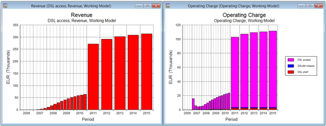
Figure 4: Graphs showing service Revenue, and service and resource Operating Charge results
You can select the Show Graph as Table option is you want to display the graph as a table; however, if the graph you select is pre-defined as a table (e.g., Profit and Loss Statement), then it will be drawn as a table even if this option has not been selected explicitly in the dialog.
Only a few pre-defined graphs have a specific pre-defined format (e.g., the Unit Utilisation graph for a resource has a particular squared-line stacked format). The format for any graph can be overridden in the Format tab by unchecking the Automatic checkbox and making your own Type and Style selections – see 5.2.7 Choosing another format for a graph for further details.