In order to reflect the relative significance of shorter time period results on graphs, the corresponding columns, or markers on line graphs, are plotted closer together. This also has the effect of preserving gradients on a line graph. However, if you want to focus on the shorter time period data and give them equal significance:
-
Right-click on a graph in the Results program and select Layout… from the popup menu. The Graph Layout dialog is displayed.
-
De-select the Proportional Spacing option and click OK. The graph is re-drawn with evenly spaced markers or equal-width columns.
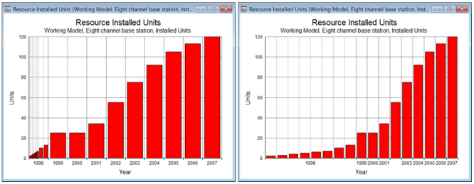
Results graph with Proportional Spacing option checked (left) and unchecked (right)
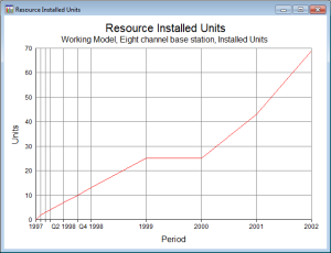
Aligning shorter time periods on line graphs
On a column graph, each X-axis interval is identified and labelled with successive periods of a model run, whereas on a line graph the data are identified with the tick marks
between
intervals. If there are n periods to be plotted, a column graph has n
intervals, whilst a line graph has n – 1.
On a proportionally spaced column graph, each X-axis interval is given a width in proportion to the number of days in the corresponding period; but on a line graph, an interval appears
between
periods, so there is a question as to whether to take the previous or following periods as the basis for the spacing. Of course, this is only an issue when the abutting periods are of different lengths.
The majority of results are either current values for the end of a period, or values over a period which can be thought of as reported at the end of a period. Thus, for most line graphs, the appropriate width for an interval is based on the elapsed time from the end of the preceding period to the end of the next, i.e., the length of the next period. For example, it is only 90 days from the end of Y0 to the end of Q1, but a full 360 days from the end of Q4 to the end of Y2. So the length of the first period on a line graph is ignored and the remaining
n
– 1 lengths are used to determine the spacing (which reflects the special base-period status of year zero).
The only exception to this rule is for a result, such as Rental Tariff, which represents the current value for the
beginning
of a period, in which case the first n
– 1 lengths are used to determine the graph spacing, and the length of the last period is ignored.
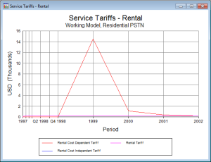
Line graphs with Beginning and End alignment
Note: In order to emphasise the temporal significance of these results, it may be helpful to include major X-axis gridlines (as shown above), which are drawn in grey by default in the new system in order to distract less from the data.