In this part of the tutorial demo, we are going to explore the initial results, now that we have linked the customer demand to the resource capacity.
- In the results program, go to the Graphs menu and open the Draw dialog.
We are going to draw the Capacities graph for Resource 1 to see how the number of customers requiring the resource is balanced by the resource capacity installed (and ensure that enough resources have been installed to meet customer demand).
- Select Resource 1 and add it to the Selected list (by double-clicking or using the
 button).
- Enter the Graphs tab and select Capacities in the list of Graphs to draw.
- Press OK to draw the graph.
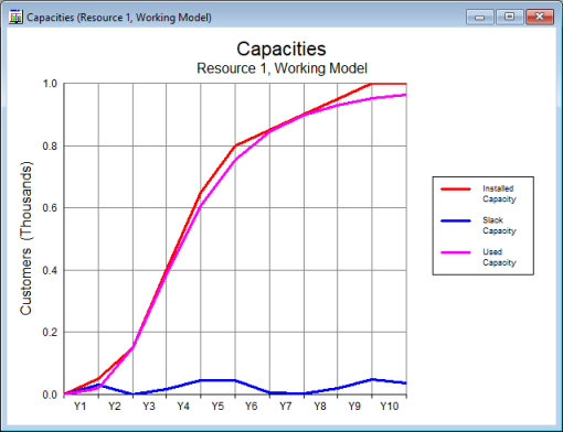
Figure 1: The Capacities graph for Resource 1
The Capacities graph has three lines:
-
Installed Capacity (red line): this represents the capacity of the resources that are currently installed. Note that it increases in amounts of 50 customers, which is what you would expect as each unit of resource can support 50 customers.
-
Used Capacity (pink line): this represents the proportion of the installed capacity that is actually required to satisfy customer demand (i.e., is actually being used).
- Slack Capacity (blue line): this represents the proportion of the installed capacity that is not currently being used by customers.
These results indicate that STEM is installing just enough of the resource capacity to support the customers (Used Capacity is nearly the same as Installed Capacity, and there is little Slack Capacity).
Note: If you redraw the Connections graph for Service 1 (as in 2.1.2 Exploring the service element), you will notice that the shape of the Used Capacity graph is the same as the Connections graph.
Now we will draw another graph.
- Ensure the Capacities graph is selected and then select Draw Another… from the main Graphs menu option.
- Select Installed and Incremental Units in the Graphs tab.
- Press OK to draw the graph.
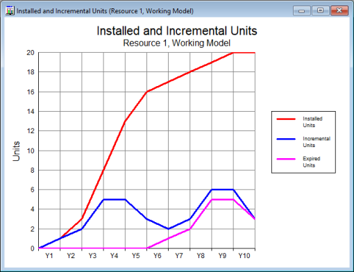
Figure 2: The Installed and Incremental Units graph for Resource 1
The previous Capacities graph was measured in terms of customer numbers (0–1000), whereas the Installed and Incremental Units graph is measured in terms of resource units. One unit of resource has capacity for 50 customers, so the y-axis scale ranges from 0 to 20 units (1000/50).
-
Installed Units (red line): shows how many units of the resource are installed.
-
Incremental Units (blue line):
shows how many additional resource units are installed each year due to incremental demand and replacement of resources as they reach the end of their physical lifetime (5 years).
-
Expired Units (pink line): shows how many units of resource are removed each year as they reach the end of their physical lifetime.
We can also draw graphs looking at the capital cost and operating costs:
- Right-click on the Installed and Incremental Units graph and select Draw Similar… from the context menu (alternatively, with the graph selected, you can select Draw Similar… from the main Graphs menu).
- Select both Capital Expenditure and Operating Costs in the Graphs tab (by left-clicking with the <Ctrl> key pressed down).
- Press OK to draw the two graphs.
Note: try accessing the Graphs menu and selecting Tile to rearrange the graphs like tiles so that they can all be seen readily at once.
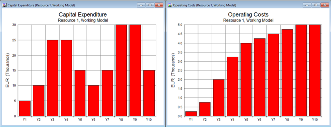
Figure 3: The Capital Expenditure and Operating Costs graphs for Resource 1
The shape of the Capital Expenditure graph is the same as the Incremental Units graph, as for each additional unit installed there will be EUR 5000 of capital expenditure.
The Operating Costs are directly proportional to the number of installed units, as each unit of equipment that has been installed will require maintenance (operating costs).
You can see that we have quickly drawn some useful results graphs with just a few inputs. However, it is important to consider how realistic these results actually are, which we will do by drawing the Utilisation Ratio graph – a measure of how intensively used each piece of equipment is (Utilisation Ratio = Used Capacity / Installed Capacity).
- Draw the Utilisation Ratio graph by using the Draw Similar… command and selecting Utilisation Ratio in the Graphs tab.
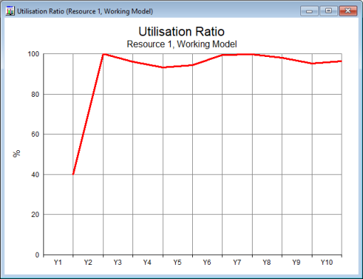
Figure 4: The Utilisation Ratio graph for Resource 1
You can see that the utilisation ratio reaches 100% after just 2 years and then decreases slightly, but generally remains high. What is happening? It may be easier to understand if we look at the actual numbers.
- Show the Capacities results as a table by right-clicking on the Capacities graph and selecting Show Separate Table….
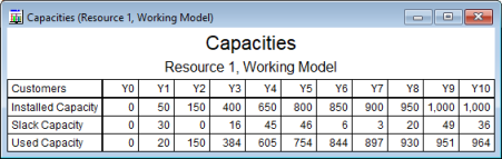
Figure 5: Showing the Capacities results as a table
In Y1, there is one installed unit of the resource and just 20 customers, so the utilisation ratio is 40% (20 customers using a resource with capacity for 50 customers). In Y2, there are 150 customers, so three units of the resource can support all 150 customers, with no slack capacity (i.e., utilisation ratio = 100%). In Y3, addition of just one more customer would require an extra unit of resource, so addition of 234 customers requires an additional 5 resources, with a small amount of slack capacity (enough for 16 customers), so the utilisation ratio remains high, at about 96% (the worst case would be 151 customers, with four installed units of resource, so the utilisation ratio will never be less than 75%).
Overall, these results look plausible. However, we haven’t yet considered the geographical aspect of the model: in reality, it is likely that the 150 customers in Y2 will actually be distributed across ten geographically separate sites, averaging 15 customers per site. As the resource equipment cannot be shared across sites (as specified at the beginning), we will actually need at least one unit of the resource at each site, so at least ten resource units will be required for 150 customers, rather than the three we have currently calculated, which would have a large impact on the utilisation ratio (it would decrease considerably to 30%).
In the next part of this tutorial demo, we will create a more realistic business case by using STEM to actually deploy the resource equipment using a location element.
 Things that you should have seen and understood
Capacities graph
Format Axis, Draw Similar, Draw Another, Tile
Utilisation Ratio