In this section, we are going to explore the service element in the model and add assumptions to capture the forecasts for the number of subscribers.
- Select Service 1 by right-clicking on it to display the context menu with several groups of menu items.
The first group contains the input assumptions relevant to a service, whereas the other groups are common to all element types. At present, we are only interested in the first group.
- Select Demand by left-clicking on it. The service Demand dialog is displayed.
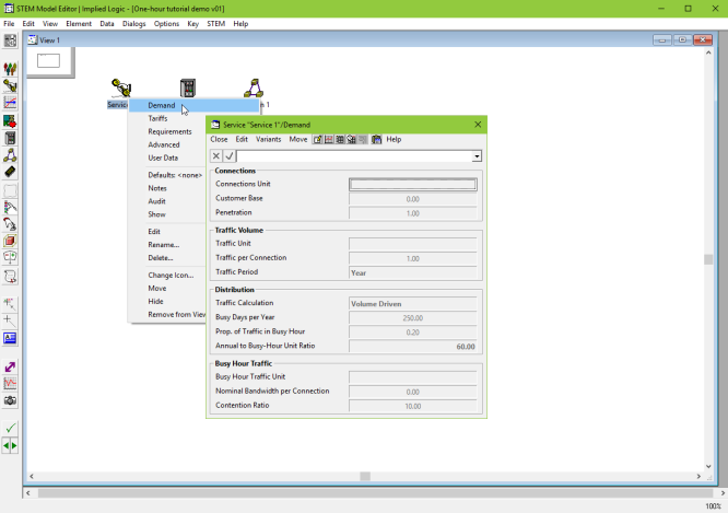
Figure 1: Accessing the service Demand dialog
This dialog gathers together all of the primary assumptions relating to the service demand. For now, we are only interested in the Connections section.
- The Connections Unit field is selected by default.
- Enter Customers. The focus will switch to the formula bar and the
 buttons will be enabled. Alternatively, you can choose one of the predefined units from the drop-down to the right of the formula bar.
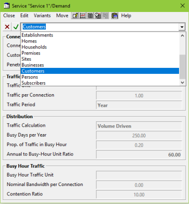
Figure 2: Entering data in the service Demand dialog
- Press <Enter> or <Tab>, or click
 to accept the change.
- Left-click on the Customer Base field and enter 1000 for the number of potential subscribers in the market. Press <Enter>.
 Note: if you prefer you can use the separate market segment element to capture the size of the market, and then link this to the service element so that the Customer Base input of the service pulls its value through from the market segment. This is particularly helpful if the business modelled offers multiple services to the same target customers.
The Penetration input determines the ongoing proportion of the target market. 100% penetration would mean that all of your potential customers (1000) have subscribed to your service, whereas 20% penetration would mean that 200 out of 1000 potential customers have subscribed. The input can be scalar or a time-series. In this example, we will use an S-curve growth, using the inputs outlined in Figure 1 in 2.1 One-hour tutorial demo, whereby the number of subscribers is initially low, increases gradually, and then levels off as it reaches a saturation point (100%).
- Right-click on the Penetration field to access the context menu.
- Left-click to select Change Type… and then S-Curve. The S-Curve dialog will open.
Note: alternatively, right-click on the small button on the right of the Penetration field to access the Penetration dialog, and select S-Curve from the dialog Type menu.
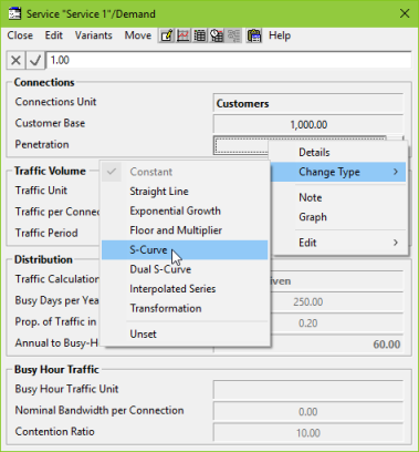
Figure 3: Accessing the S-Curve dialog
- Enter the following values:
Saturation = 1.00 (i.e., 100%)
Base Period = Y0 (i.e., no customers in Y0)
Period A = Y1
Value A = 0.02 (i.e., 2% penetration in Y1)
Period B = Y2
Value B = 0.15 (i.e., 15% penetration Y2)
- The dialog should now look as shown in the figure below:
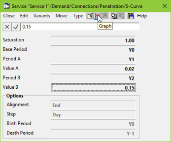
Figure 4: Customer data in Penetration/S-Curve dialog
- Press the Graph button
 on the dialog to check (preview) that the interpretation is as expected. It should look like this:
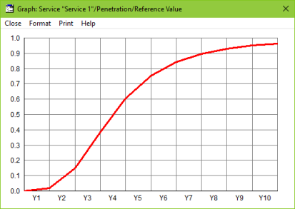
Figure 5: Graph showing customer penetration
The graph indicates that there are no customers in Y0, 2% penetration (20 customers) in Y1, 15% penetration (150 customers) in Y2, and then a gradual increase in customers from Y3 onwards, approaching saturation (100% penetration) by Y10.
Note: linking input assumptions from a spreadsheet (or any mainstream database) is easy, starting with the Export Model Data command on the File menu to generate the required format in Excel to link all the required assumptions for a whole element in a single link – see 6.3 Linking input data from Microsoft Excel spreadsheets.
The STEM Editor program contains your input assumptions for all of the elements in a model. Now we will run the model and access the results in the STEM Results program.
- Go to the main File menu in the Editor and select Save and Run (or press <F5>).
- Ignore any prompts about data warnings (just press Yes to continue).
- The model will run and the STEM Results program will open automatically .
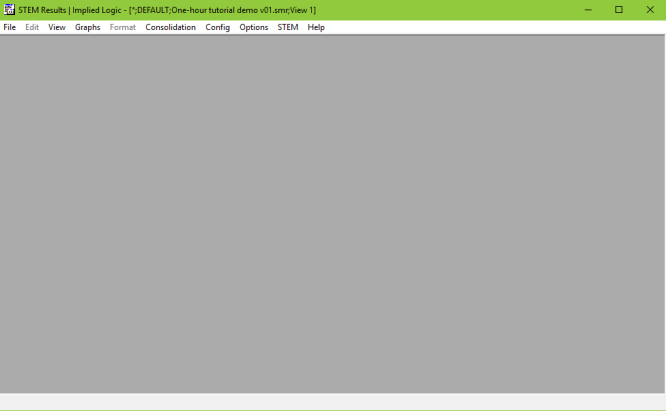
Figure 6: The STEM Results program
We will draw a graph to look at the results for Service 1.
- Left-click on the Graphs menu and select Draw… to open the Draw dialog.
- Left-click Service 1 in the Available list and add it to the Selected list by pressing the
 button (or by double-clicking on Service 1).
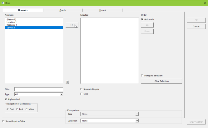
Figure 7: Selecting Service 1 in the Draw dialog
- Click on the Graphs tab at the top of the dialog. A list of Graphs to draw is displayed in the Graphs tab.
- Select the graph you want to draw, in this case Connections, and press OK to draw the graph.
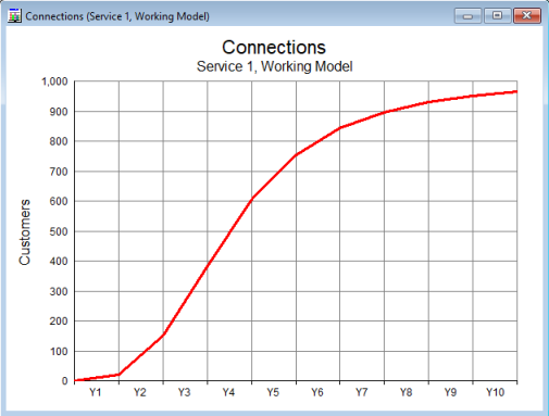
Figure 8: The Connections graph for Service 1
The resulting Connections graph has exactly the same shape as the Penetration graph we drew in the Editor: the difference is that the Connections graph tells you the actual number of customers that have subscribed to the service. Check the values are the same as those you would expect (e.g., 2% penetration in Y1 should equate to 20 customers). (If you right-click on the graph and select Show Graph as Table you will be able to see a table showing the numeric values.)
In the next part of this tutorial, we will explore the concept of a resource and see how this captures what you actually have to provide for your customers.
 Things that you should have seen and understood
Service, Demand dialog
Customer Base, Penetration, Change Type, S-Curve
Run model, Results program
Drawing graphs, Show Graph as Table