The Format Axis and Change Axis Style dialogs can be accessed by right-clicking on the graph and selecting Select Graph Item…, followed by Axis, and then selecting either Format Axis… or Change Axis Style…. The same options can also be accessed by right-clicking on the axis itself, or by double-clicking on the axis to access the Format Axis dialog directly.
See also 5.1.3 Smart labelling for time-based charts.
Format Axis
The Format Axis dialog allows you to amend the way axes are labelled and scaled, and to determine whether or not gridlines are shown. Selection of this command displays one of two dialogs, according to whether the selected axis is the Category axis or the Value axis.
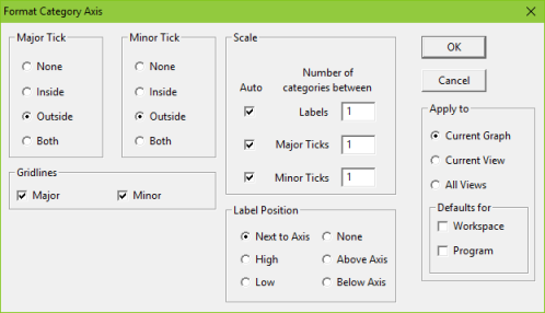
Figure 1: The Format Category axis dialog
Major Tick/Minor Tick
Select from the options how you want the ticks (scale marks) to appear on the X and Y axes, i.e., whether there should be no ticks (None), inside ticks (Inside), outside ticks (Outside) or both inside and outside ticks (Both).
Gridlines
Checking in these boxes defines whether horizontal (Category) and vertical (Value) Major and Minor gridlines are added to the graph. (These items can also be accessed by selecting Gridlines from the Select Graph Item… menu or by double clicking or right clicking on a gridline – see 5.8.6.2 Gridline format and style.)
Scale (Category axis)
The options in this part of the dialog determine how many, and at what intervals, labels appear on this axis.
If all options are set to Auto then STEM will determine the frequency with which labels appear along the scale and the frequency of the major and minor ticks. Frequencies are adjusted according to the length of the label and the number of categories in the scale. The Number of Categories boxes indicate the values that have been automatically assigned, for example:
-
Labels 2 indicating that a label is added to every other major tick
-
Major Ticks 1 indicating that a major tick is added to every category
-
Minor Ticks 0.5 indicating that each category is divided into 2 by a Minor Tick
You can amend automatic values simply by highlighting the appropriate text box and typing in the desired limits.
Note: the scale and label position can also be altered in the Format Category Labels dialog.
Scale (Value axis)
The options in this part of the dialog determine the extent of the scale and how many and at what intervals labels appear on this axis. With all the check boxes on Auto, STEM automatically adjusts the scale and labels according to the data so as to give a graph that shows all the data in a form that is as easy to read as the data allows.
Major Unit: this indicates the major unit scale – a label appears at these intervals. If you amend the Major Unit scale, STEM may adjust the Minor Unit appropriately.
Minor Unit: this indicates the frequency of the minor unit tick marks.
Minimum: this indicates where the scale begins (usually 0 but not always, e.g., negative cash flow).
Maximum: this indicates the maximum for the scale, given the Major Unit. For example, if the maximum data item in a graph is 27,000 and the Major Unit scale is set at 1000, then the Maximum scale will be 27,000. If the Major Unit is set at 5,000 the Maximum scale will be 30,000.
You can amend the automatic settings for the Maximum and Minimum scales simply by typing new figures into the text boxes.
Magnitude: this changes the order-of-magnitude scale used, so that figures are shown in thousands or millions, for example. The title of the Y-axis is changed to use the order of magnitude selected, for example "US$ (Thousands)", and the magnitude of the numbers shown is modified appropriately. Note that one of the options in the Magnitude setting is Percentage. This can be used to present small numbers as percentages.
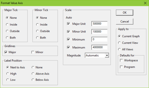
Figure 2: The Format Value axis dialog
Note: the scale and label position can also be altered in the Format Value Labels dialog.
Label Position
These options define where the axis labels appear on the graphs. How they display is also influenced by the setting for the graph origins. There are numerous combinations which enable you to display labels in the best way to suit the data in a graph. It is recommended that you experiment with the options to achieve the optimum for any particular graph.
Selection of High will move the labels to the top or right of the graph, whereas selection of Low will move the labels to the bottom or left of the graph.
It should be borne in mind that if the Graph style selected is for horizontal bars then the X (category) and Y (value) axes reverse their positions, i.e., the X axis becomes vertical and the Y axis horizontal.
Change Axis Style
Using this dialog you can change the Automatic Style, thickness (Width) and Colour (see 5.8.4.2 Re-colouring the text on a graph or table) in which the X/Y axis appears in graphs.
If you do not want the axis to appear at all on a graph, select None.
If you change any of the drop-down list boxes, this will automatically highlight the User defined option.
Selection of Change will take you to the Select Colour dialog. Unlike setting the colour for text, changes here will alter the corresponding palette entries for the given chart directly and will cause it to have its own local palette unless you also apply the change to the workspace defaults. Therefore, it is not recommended to alter chart colours in this way unless you specifically want a given chart to look different.
The Sample box shows the effects of any changes you make.
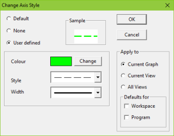
Figure 3: The Change Axis Pattern dialog showing User defined options
Change Origin
The Change Origin dialog can be accessed by double-clicking on the graph origin, or by selecting Select Graph item…, followed by Origin, and then Format Origin….
Apply to
All these dialogs have the same consistent choices for Apply to available in other dialogs – see 5.8 Formatting graphs.