The assignment of palette colours to individual data series is purely a function of the order in which the series appear on the chart. If one chart shows three resources and another chart shows only the second and third, then the second resource will get ‘the first colour’ in the latter chart.
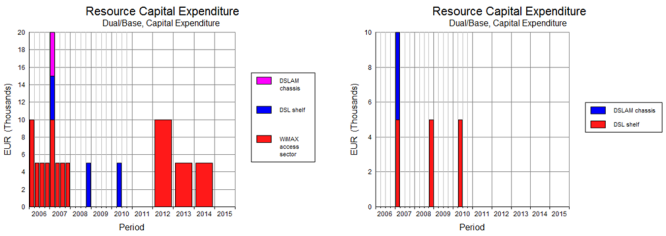
Figure 1: The element DSL shelf appears second up on the chart on the left but first up on the right
This is not often a problem, but if the two charts appear side-by-side as part of the same analysis, then it will be preferable on occasion to alter the appearance of the second chart to match the first:
-
Right click the relevant lines, bars or columns on the chart and then select Change Series Pattern… from the context menu. The Change Pattern dialog is displayed (or Change Line Style dialog if it is a line chart).
- If the chart is a line chart, then pick a different colour from the Colour dropdown; otherwise review both the Foreground and Background colour choices which make up the series pattern.
- Click OK.
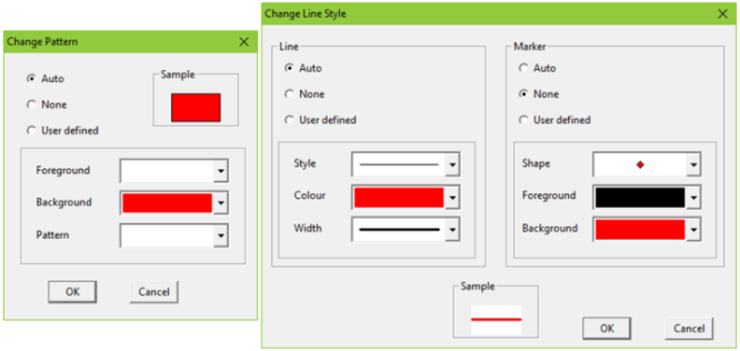
Figure 2: The Change Pattern and Change Line Style dialogs
The sixteen colours available to choose from are precisely those defined in the Series Palette described in 5.8.5.1 Defining the default palette. This process re-assigns colours from the existing palette to specific series as opposed to choosing a different set of colours altogether as described in 5.8.5 Graph Colours.